
Katherin Rendon
Katherin Rendon is a licensed Real Estate Salesperson based in NYC with a background in architecture. She is a member of PREMIERE Group.
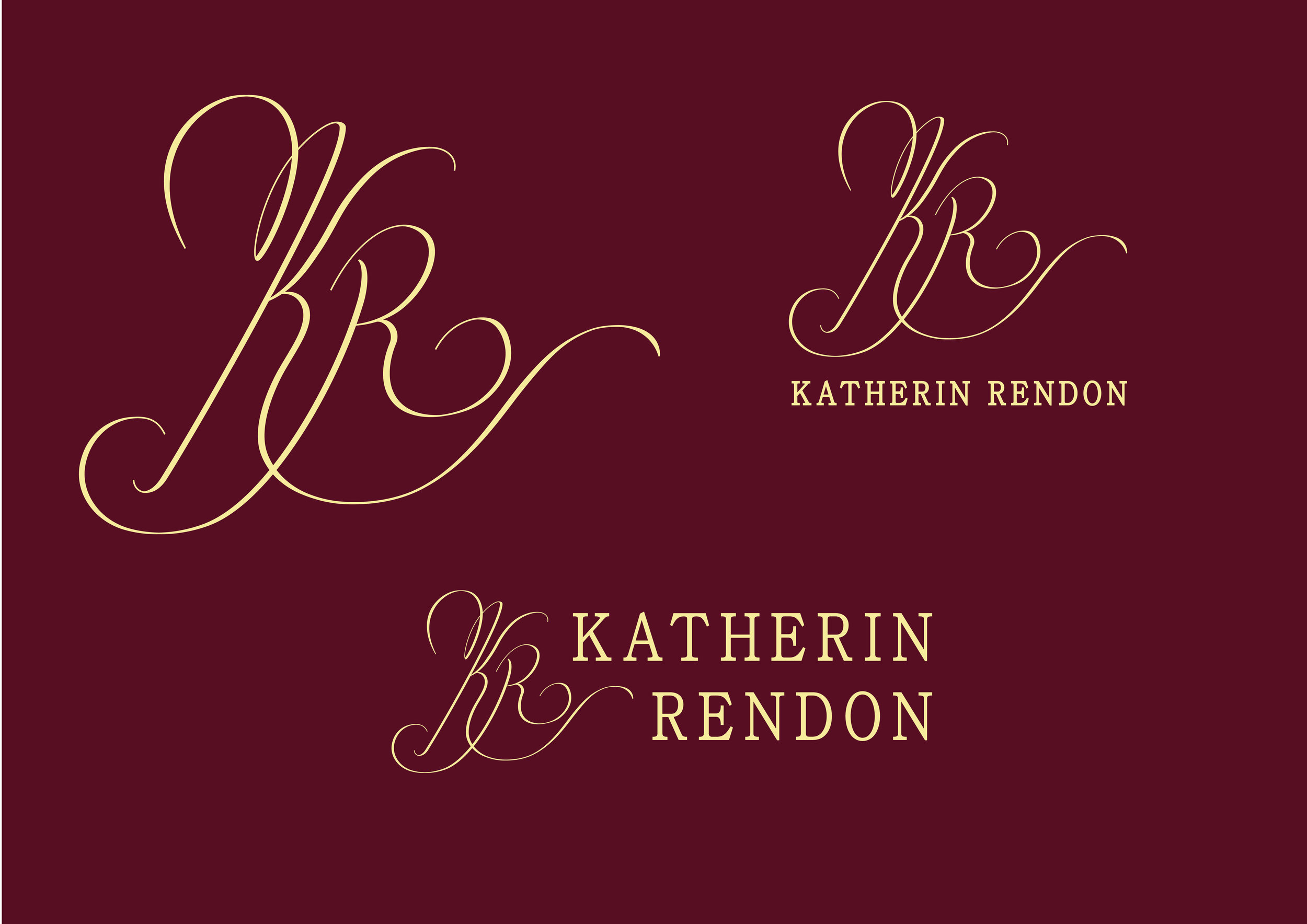
I designed KR’s visual identity and logo to reflect her bold and creative approach to the industry.
Scope:
Branding
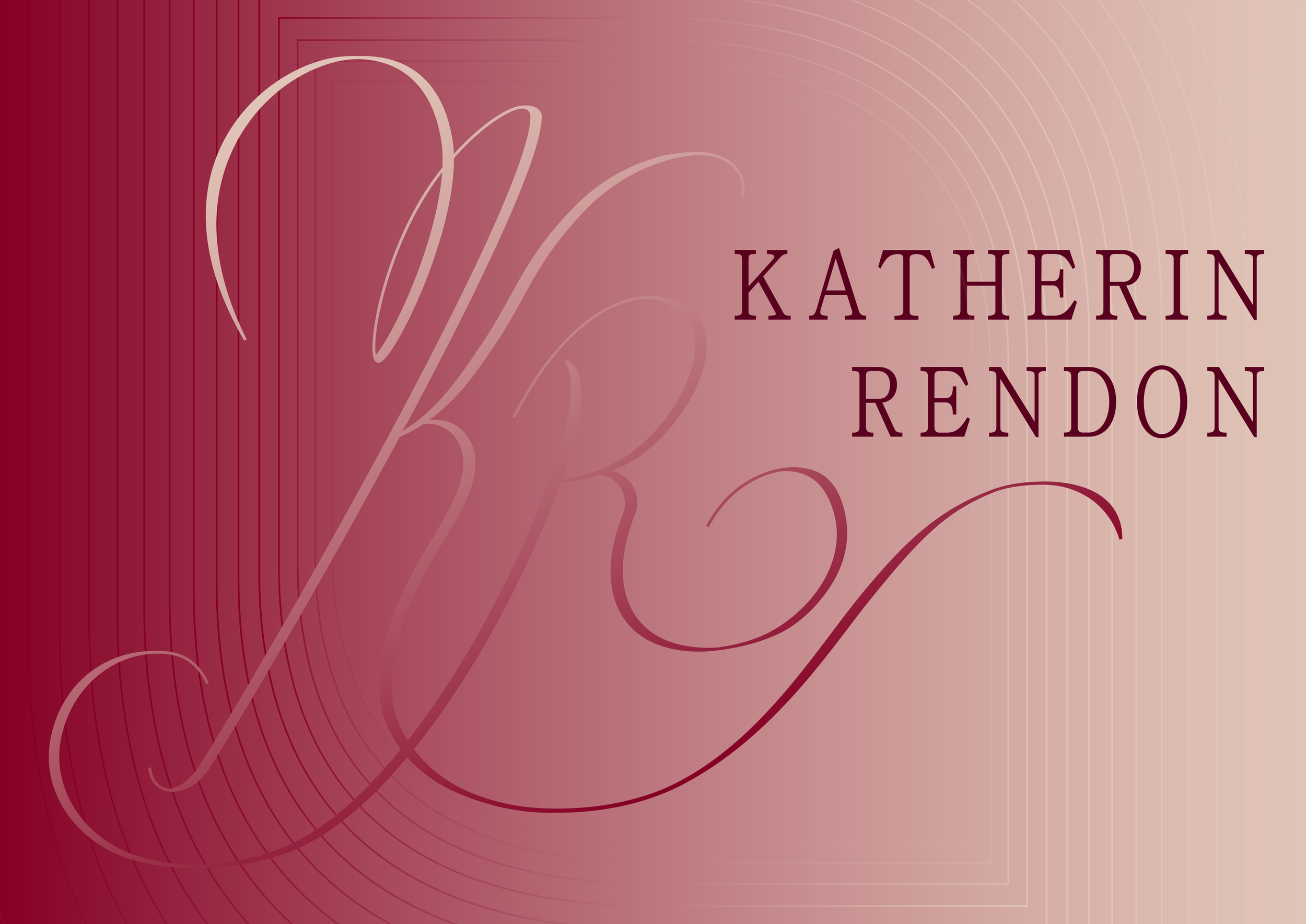
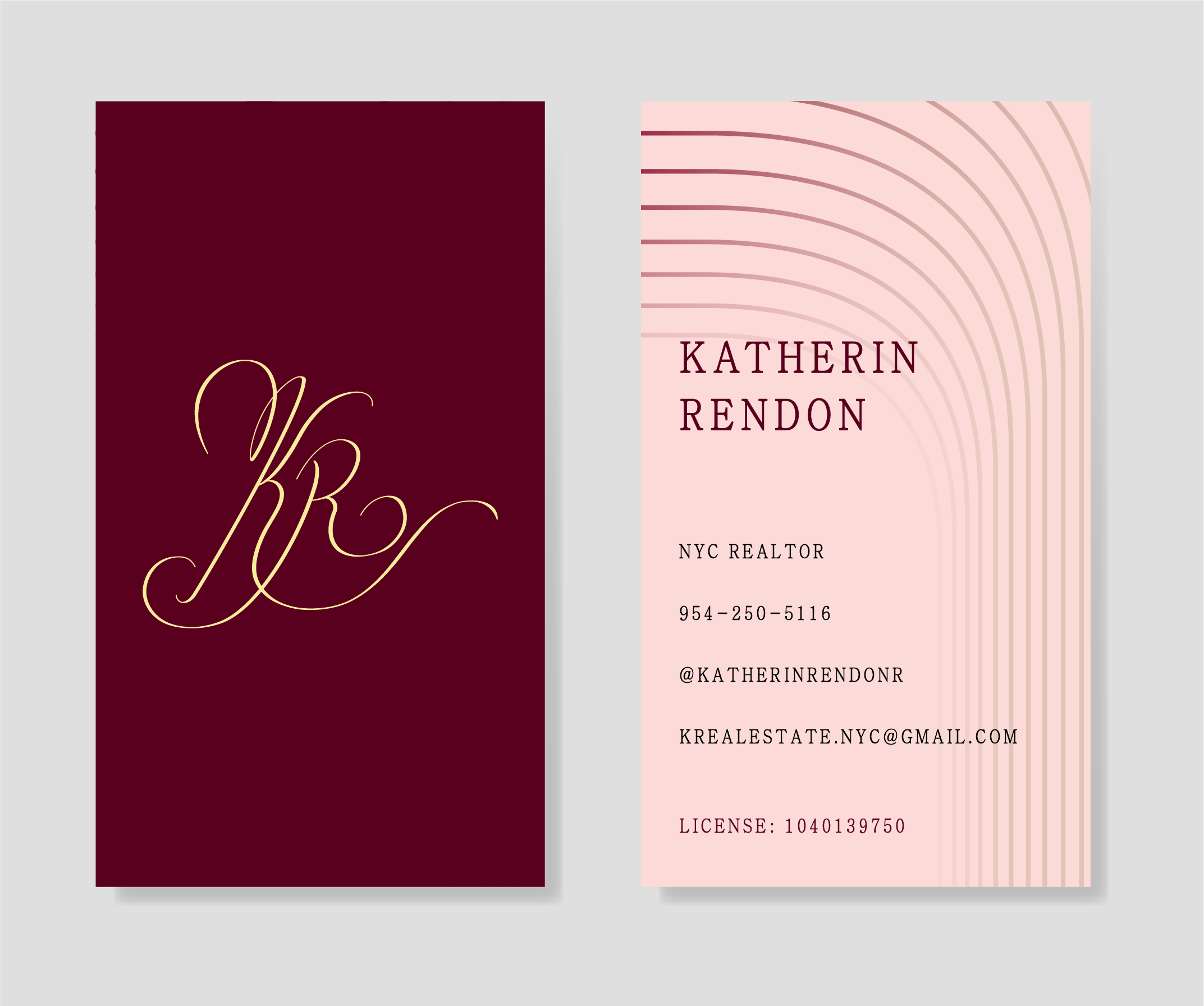
Katherin's monogram draws inspiration from her vision of architecture as a flow from one space to another. This idea is carried through the letterforms K and R as they loop with each other, paired with a bold serif typeface. The goal was a mark that reads clearly across digital platforms, bold and memorable.
The color palette centers on wine, rose, and yellow as primary colors. Gradients built from variations of wine and rose extend the palette across applications. This vocabulary is implemented on a digital business card, a printed business card, and additional collateral.

Engagement
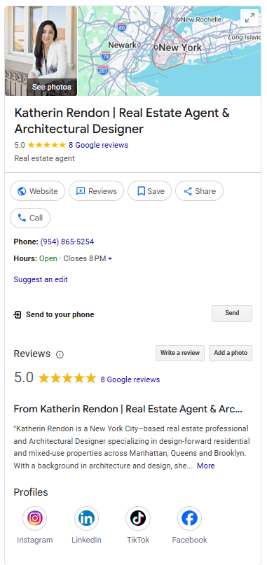
A Google Business Profile and presence across Instagram, TikTok, and Facebook serve as key channels for expanding Katherin's digital reach. I developed her social media strategy, advising on the creation of reels to highlight properties, including shooting style and posting frequency. The Google Business Profile was launched in March 2025; performance data is accumulating.
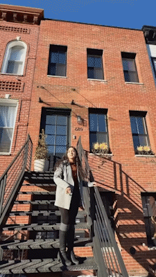
Portrait by Joha Photography.